How to create a grid with flexbox in React
Published on
Last updated on
3 min read • --- views

Often in the life of a web developer, you need to make a grid, but the limitations of the browser (Internet Explorer 😭) do not allow you to use, for example, CSS Grid.
This is where CSS Flexbox comes to the rescue. He is our friend, brother and helper. 🫡
This post is about how to create a flexbox-based grid component in React. The component should be reusable and painless to configure.
If you have problems coming up with class names, I have a selection of common class names on my blog
Preparation
Many of those who created components in React are familiar with the classnames library, but I want to recommend you the clsx library, which is smaller and similar in functionality.
It is not necessary for our component, but it is more comfortable with them:
npm i clsx
Step 1: Create React component architecture
const Grid = ({ children }) => <div className="grid">{children}</div>;
const GridColumn = ({ children }) => (
  <div className="grid__col">{children}</div>
);
const GridRow = ({ children }) => <div className="grid__row">{children}</div>;
Step 2: Create styles with SCSS
I use the BEM methodology for styles, as I think it is excellent for component libraries.
// Base styles
.grid {
  width: 100%;

  &__row {
    display: flex;
    flex-wrap: wrap;
  }

  &__col {
    flex-grow: 1;
    flex-shrink: 0;

    // For decoration only
    background-color: #bbeffd;
    border: 1px solid #61dafb;
    padding: 15px;
    text-align: center;
    margin-bottom: 25px;
  }
}
What about columns logic?
.grid__row--col-3 > .grid__col {
  width: 33%;
}

.grid__row--col-2 > .grid__col {
  width: 50%;
}
It is so ugly. Why we need to do it manually?
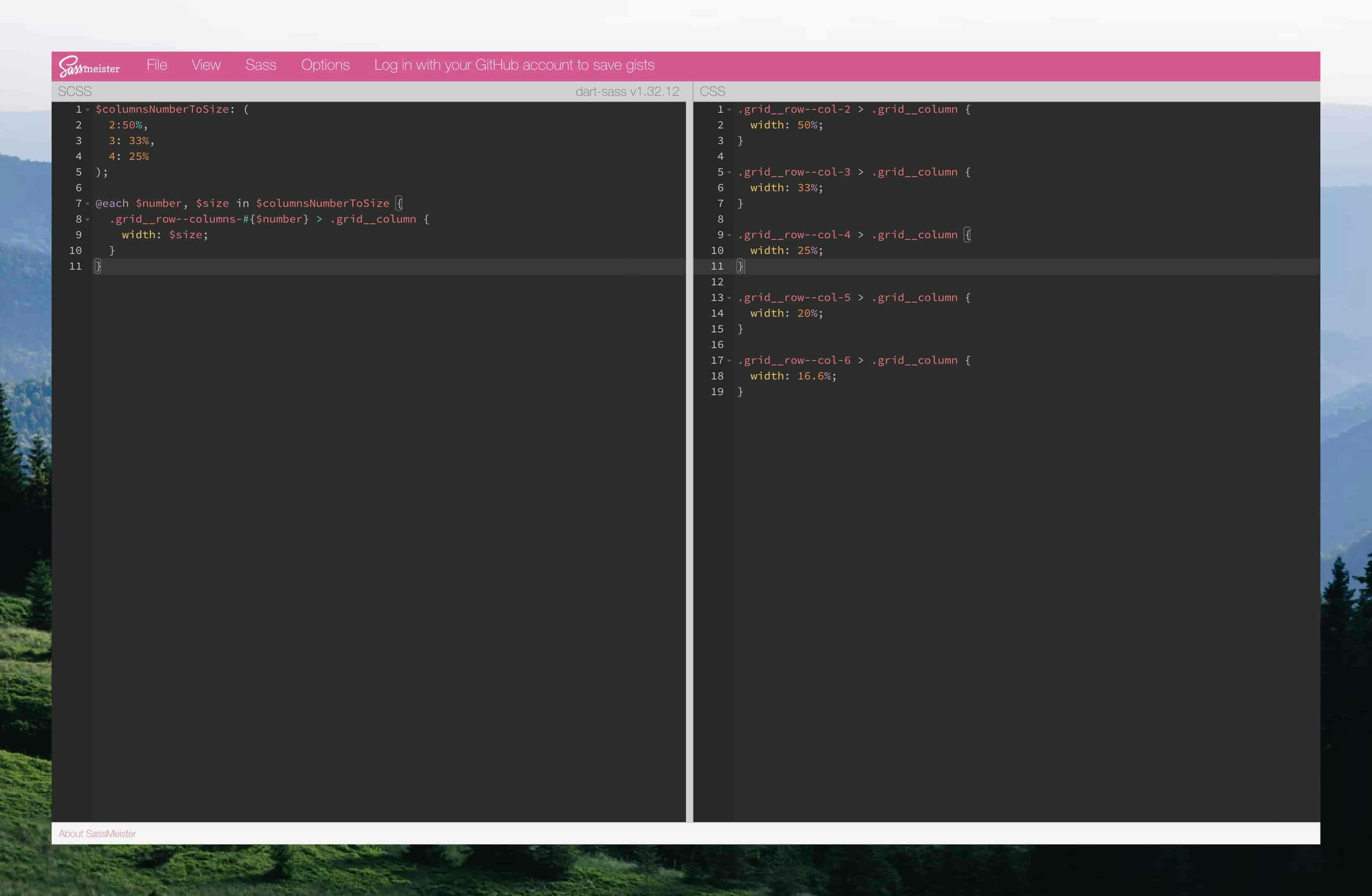
Let's try some Sass magic 🪄?
$columnsNumberToWidth: (
  2: 50%,
  3: 33%,
  4: 25%,
  5: 20%,
  6: 16.6%,
);

@each $number, $width in $columnsNumberToWidth {
  .grid__row--col-#{$number} > .grid__col {
    width: $width;
  }
}
You can see how SASS code is transformed into CSS here:
Step 3: Add logic to the GridRow component.
import clsx from 'clsx';

const GridRow = (props) => {
  const { children, columns } = props;

  const rootClasses = clsx('grid__row', {
    [`grid__row--col-${columns}`]: columns,
  });

  return <div className={rootClasses}>{children}</div>;
};
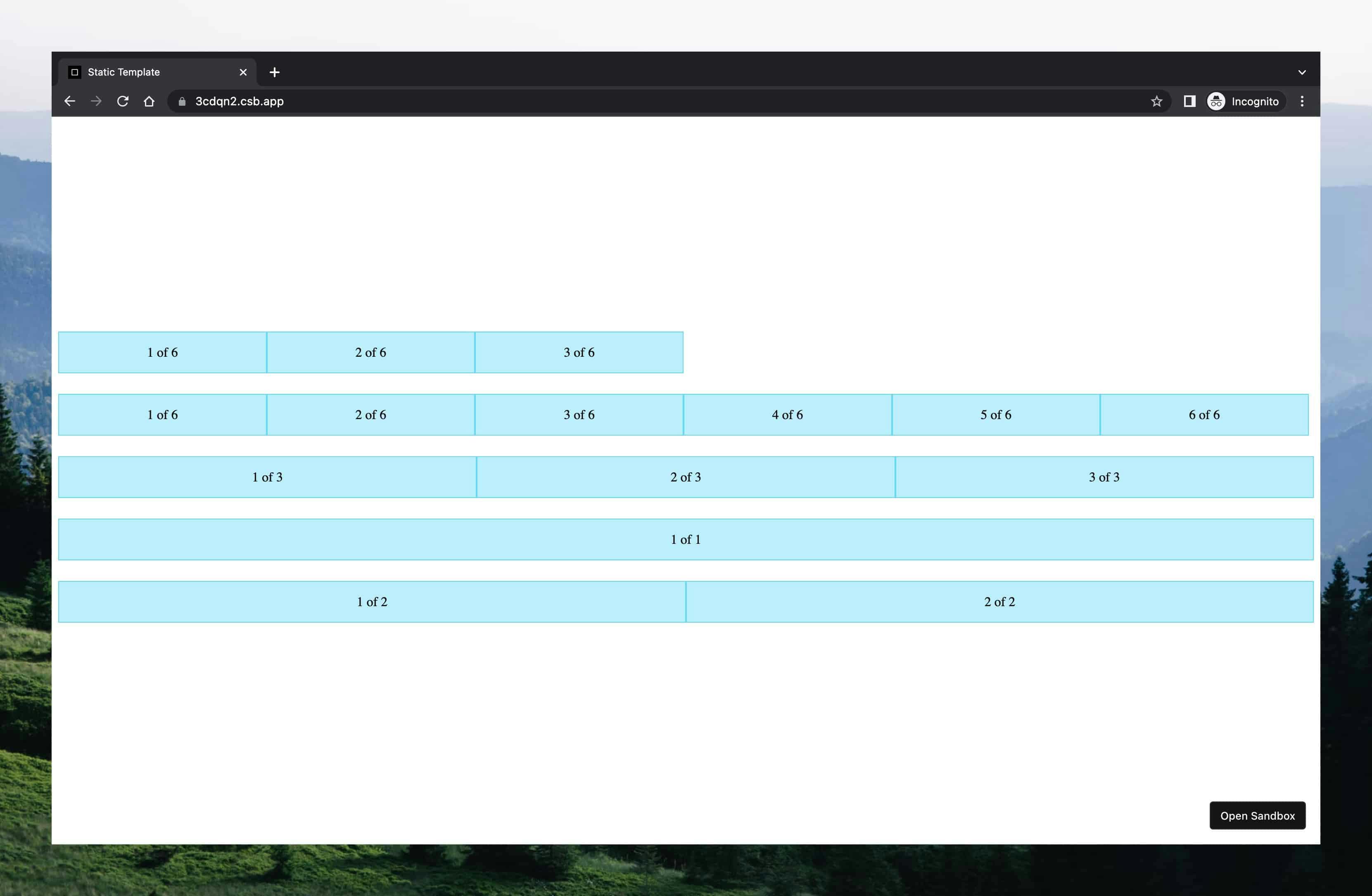
Let's check result
<Grid>
  <GridRow columns={6}>
    <GridColumn>1 of 6</GridColumn>
    <GridColumn>2 of 6</GridColumn>
    <GridColumn>3 of 6</GridColumn>
  </GridRow>

  <GridRow columns={6}>
    <GridColumn>1 of 6</GridColumn>
    <GridColumn>2 of 6</GridColumn>
    <GridColumn>3 of 6</GridColumn>
    <GridColumn>4 of 6</GridColumn>
    <GridColumn>5 of 6</GridColumn>
    <GridColumn>6 of 6</GridColumn>
  </GridRow>

  {/* ...  */}
</Grid>
Recap
Writing components has an endless process ♾.
Next, you can add a dynamic size of each column, column gaps, change the component tag type, breakpoints and so on...
Therefore, below I share additional materials that may be useful:
- A Complete Guide to Flexbox
- Flexbox Froggy Game
- React bootstrap Grid system
- CSS Class Naming Conventions - learn more about BEM methodology used in this example
Share it: